Picking a Thermal Color Palette

While thermal images may sometimes look like standard photographs, their vivid colors or contrasting grayscale details represent a very specific, very large data set of temperature information. Understanding what these colors and shades represent can help with detecting everything from a water leak to a missing person.
Like any digital image, thermal images are made up of pixels. In thermal imaging, each individual pixel represents a specific temperature data point. These data points are assigned a unique color or shade based on their value, meaning that as the thermal sensor detects changes in heat energy, it will express this change by adjusting the color or shade of a pixel.
Switching palettes changes the appearance of a scene and highlights key areas of a thermal image without altering any temperature data. Thermal palettes are largely a matter of user-preference, but different environments or situations might benefit from one palette over another.
Here are the palette options you're likely to see:
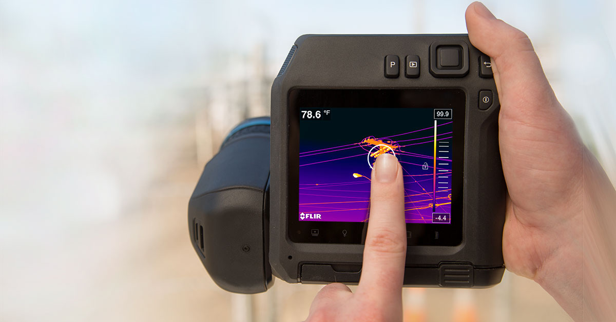
IRONBOW:
A favorite among thermographers, Ironbow is a general-purpose palette that quickly identifies thermal anomalies using color to show heat distribution and subtle details. Hot objects are shown in lighter, warm colors while colder objects are dark, cool colors.

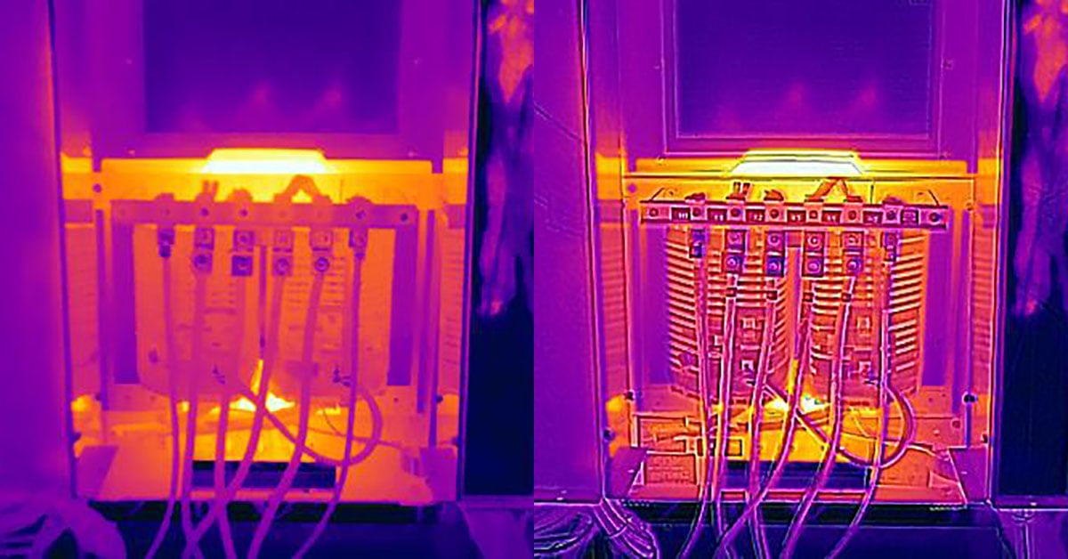
RAINBOW:
Rainbow is similar to Ironbow with warm colors representing the hottest part of the image and cool colors representing the coldest parts, but adds more colors into the mix. It’s good for pinpointing objects in environments with minimal heat differences.

RAINBOW HC:
Rainbow HC, or Rainbow High Contrast, does just what the name says: it adds more contrast to the image. This allows you to see more even detail compared to other palettes and spot subtle temperature differences.

ARCTIC:
Identifying warm objects with a golden color and colder objects with shades of blue, the Arctic palette mixes the simple coloring of Ironbow with the low-contrast performance of Rainbow HC. Differing colors quickly detect heat sources while darker shading picks out slight temperature changes.

LAVA:
Similar to Ironbow and Arctic, Lava displays hot objects and warm colors and colder objects in blue. It’s another good option for quickly capturing body heat and other details in low-contrast environments.

WHITE HOT:
The most commonly used palette across the board, White Hot displays warmer objects in white and cooler objects in black. Grayscale palettes offer simplicity for scenes with a wide temperature span and generate images with realistic details. The versatility of White Hot makes it appealing for use in shifting landscapes and urban areas.

BLACK HOT:
Black Hot is the inverted version of White Hot, displaying warmer objects as black and cooler objects as white. A favorite among law enforcement and hunters, Black Hot displays body heat in a clear, lifelike image.

ISOTHERMS:
Isotherms are bright colors — usually red, yellow, or blue — that highlight certain temperature ranges in a grayscale image. These ranges can be set by the operator, or might be pre-set in the camera. Industrial thermographers use isotherms to alert them to hot equipment operating outside of safe limits or cold areas that might indicate a water leak, while firefighters use them to find the hottest areas of the fire.

InstAlert on the Scout series or the Graded Fire palette on the Scion series are examples of pre-set isotherms.

Each user views and interprets thermal images differently. The simplicity of White Hot may not provide enough detail for some applications, while the high contrast of Rainbow HC might be too busy for some use-cases. Getting hands-on experience with each available palette is the best way to make informed decisions in the field or when generating a report.
Related Articles
-
 Fundamentals
What is 1-Touch Level/Span?
Learn more -
 Fundamentals
What is MSX®?
Learn more -
 Fundamentals
How Far Can You Measure with a Thermal Camera?
Learn more